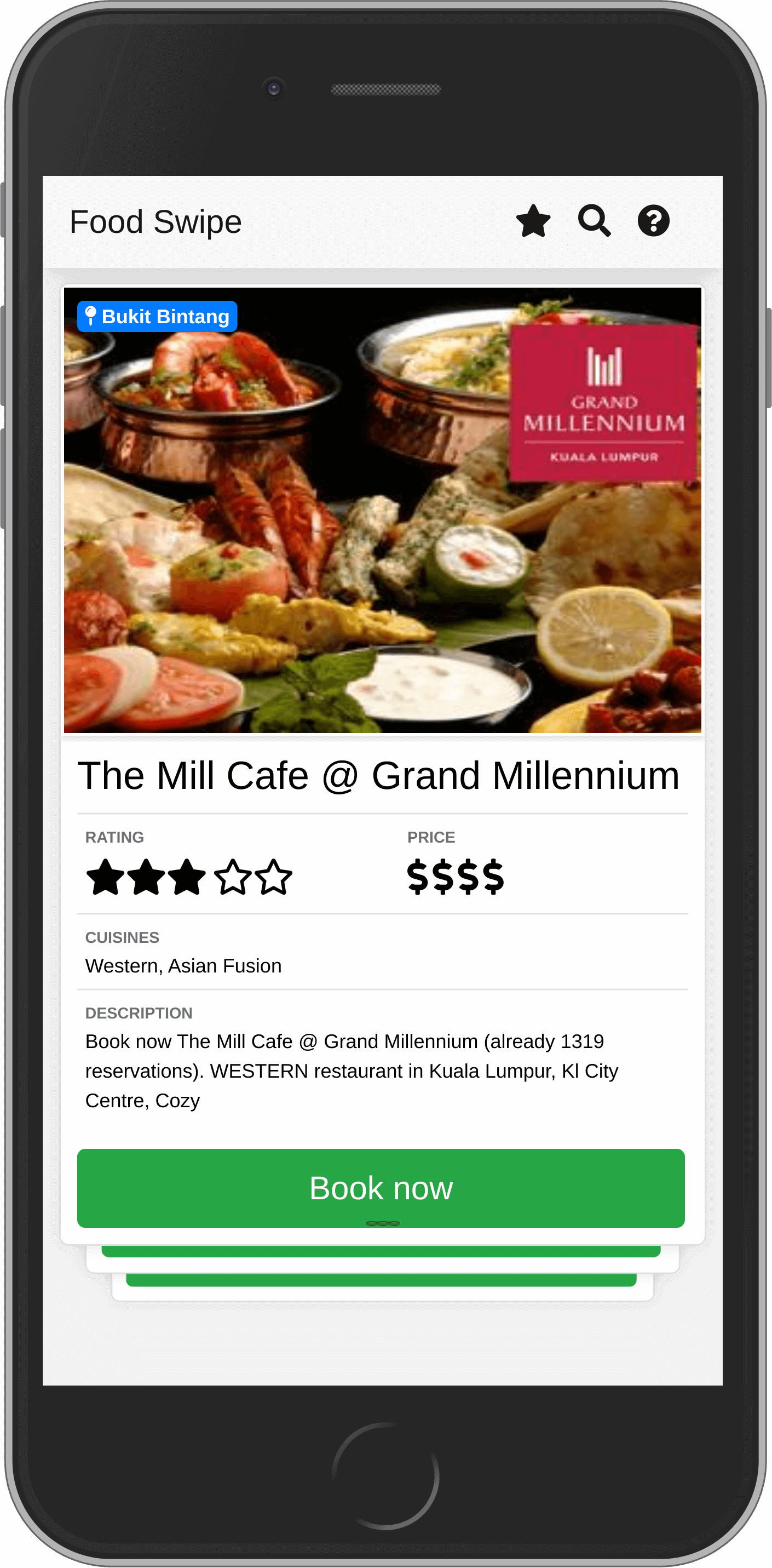
The Tinder interface is great for making a quick judgement for a low impact decision. A while back I built several prototypes that use that interface and realized that it works well for deciding where to eat.
- First impressions are based on appearance
- There’s a lot of choice
- Not a lot of info is required upfront

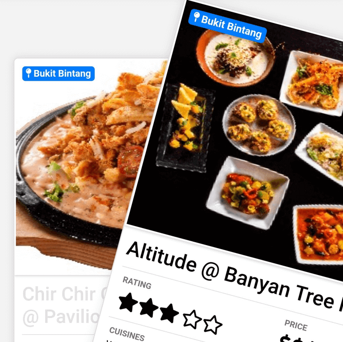
And you could swipe through the restaurants, till you found one you liked.
It's a video, it might take a second to load.
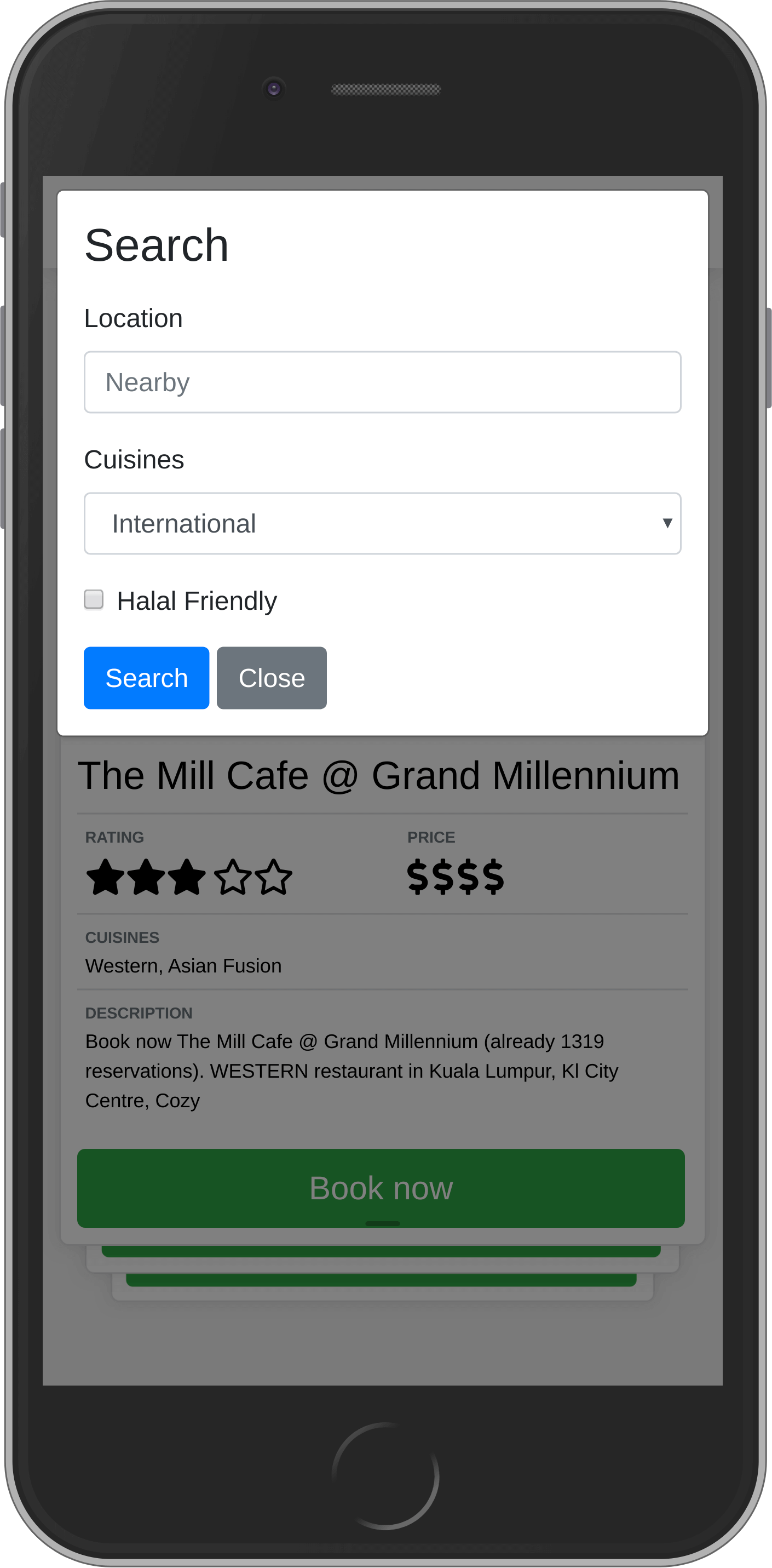
There could also be a more traditional search.

But preferences for discounts or distance are probably more important.
The benefit of this approach is the ability to order and present restaurants algorithmically. The aim would, of course, be to increase bookings both for restaurants and users.
Some ways that restaurants could be biased towards in the list:
- Probability of booking when seen the first time (some deals are just that good)
- Frequency the user books when within a specific distance (users like their regular places)
- Users preference based on attributes (cuisine, location, ambiance, price, discount, etc)
- Frequency of bookings for a particular type in the area (certain areas result in more bookings for specific types of places)
The concept here is for making a reservation but could similarly work for delivery as well.
Demo on http://food.ognjen.io/ (For a smartphone)

