I’ve stopped using Reddit mostly because I no longer wanted to support a site that has aggressively started to employ disrespectful design patterns. Not only that, but they kept trying to present them in a way that made it seem like they’re doing it for the sake of their users.
Here are examples of dark (perhaps dark is too strong but they’re certainly at least grey) patterns that I noticed:
Asking for email and making it seem that it’s required
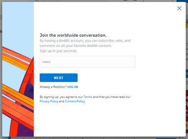
But in fact you can just click next.
Closing off subreddits for not logged in users
On mobile you can no longer browse most subreddits without an account.
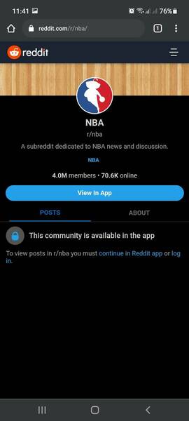
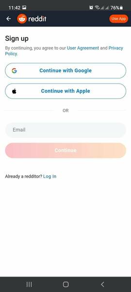
Redirecting the logo to registration page
And when you land on a subreddit that is blocked you’re likely to tap the logo to go to the homepage. But the logo has been made to link to the registration page. This gives the impression that you have to register to see the homepage as well.
If you land on a thread
First of all, only the top comment will be shown. Then you can tap view more which will load another two. But you cannot open all the comments.
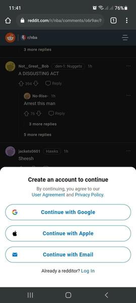
And you can’t even view some threads at all

Online indicators
When they added online indicators they added a way to hide your online status. Something that pretty much every chat application has. But keeping true to their disrespectful form, you don’t set your status to offline, you set your status to “Hiding”. This seems like an attempt to basically shame people into not using it.
The ads look extremely similar to regular threads
This must have been an intentional design choice. They must have known that making the results look the same as regular posts. They must have also know that users would click on them without having any intention to view the ad. They even have the comments and votes button. The only differences are the “Promoted” text. The action button is a recent addition.

The only possible conclusion, then, is that they did this specifically to inflate the number of clicks.
It then makes absolute sense that most of their clicks can be categorized as fraudulent.
The design changes are indicative of the culture
These practices are also indicative of a culture of dishonesty. Artificial metrics are prioritized over actual user experience. I understand that they need to chase profits as a heavily funded company. That’s especially true since Reddit is one of the most visited sites on the net. But these changes seem very misguided.
Profitability can be achieved in tandem with improving user experience. On the other hand, there’s little chance of improving user experience if you are ex post facto trying to justify how your changes are actually for the benefit of the users.
Why aren’t they pivoting into a marketplace instead?
I think a genuine way to improve user experience would be to support marketplace features.
There are a significant number of users who sell things via other sites. They run their communities on Reddit but then link to their Etsy or whatever to sell. If Reddit added a storefront, those communities would be able to use a single platform for their communities and sales.
Now, you might rightly argue that building a marketplace is relatively complex. But then why not copy from Patreon? Reddit has a nearly identical set of the features.
Furthermore, Patreon doesn’t allow adult content, and Reddit is full of that. So why not copy OnlyFans?
It seems they chose the easy, but dishonest, instead of the genuinely useful but more difficult.
How can this be good for them?
This is the question that keeps bothering me.
While these changes are definitely dishonest they also seem counterintuitive to me. I would assume that they’re actively alienating their users.
But, I’m reminded of the “If everyone is stupid, then why aren’t you rich” expression. Reddit has lots of competent people. So, surely they have the data to back up their decisions. And the data must be saying that these changes are working. Not only are they not backing off but they’re getting even more aggressive. I’d love to see that data.
Interesting comment from Hacker News discussion
I was the EM for Reddit’s Growth team around this time. I am responsible for / contributed to a few features like the current signup flow, AMP pages, push notifications, email digests, app download interstitials, etc. There was a new product lead who joined with many good ideas, but some of them were dark patterns that I heavily protested. After a few months of this, it was obvious that I was going to be reigned in or let go[0]; I immediately transferred to a different org.
Now let me explain the other side of the story. 4 years later, Reddit’s DAU, MAU, and revenue have all grown at ridiculous rates[1]. Yes, power users complain—and still continue using the site—but the casual user does not. These dark patterns have been normalized on other websites.
These practices are done because it works.
– wting
