As the Corona lockdown measures relaxed Selangor quite quickly introduced Selangkah: a web app that captures users’ details when they visit a store. It was later followed by KLStep, a nearly identical implementation by DBKL. The concept is very simple: a merchant exhibits a QR code that customers scan. They enter their details. Any subsequent scan of a QR code uses already saved details. It’s simple and effective.
From a professional standpoint, it’s interesting to see a web project that operates under an entirely different set of design restrictions. Most of the time we’re concerned with bounce rates and conversions. In this case, it’s efficiency that’s center stage.
There are several things that were done well:
- The speed of rollout was great. I don’t recall the exact date but I do know that it’s been there from the start of the relaxed measures.
- It is vanilla HTML, with barely any CSS
- No Javascript at all
- Very quick
- Very small
I would, however, suggest three minor changes to improve usability and efficiency.
First, would be to not use an image for the logo. While it’s quite small (13.9kB) it could be easily replaced with an SVG or even just plain text. There isn’t really a need for the network-looking stylized E. Because of the image, CloudFlare mirage is added as well. By eliminating the image and mirage.js transfer size would be 90% less, around 3kB, instead of 29.2kB.
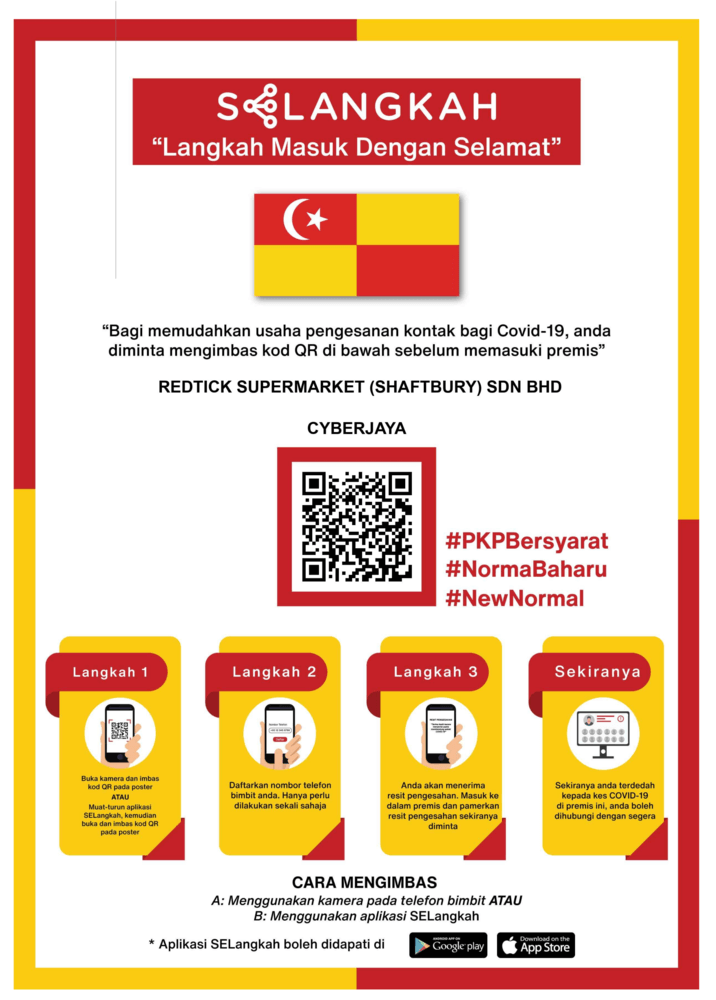
Second, the paper that the merchant prints out to display in front of the store currently looks like this:

It makes poor use of space. It looks as if it’s designed to be held at reading distance. In reality, the paper is on a wall or stands on a table and is much further away from. Because the QR code is very small users have to get really close to the page to scan it. That brings several people near each other as well.
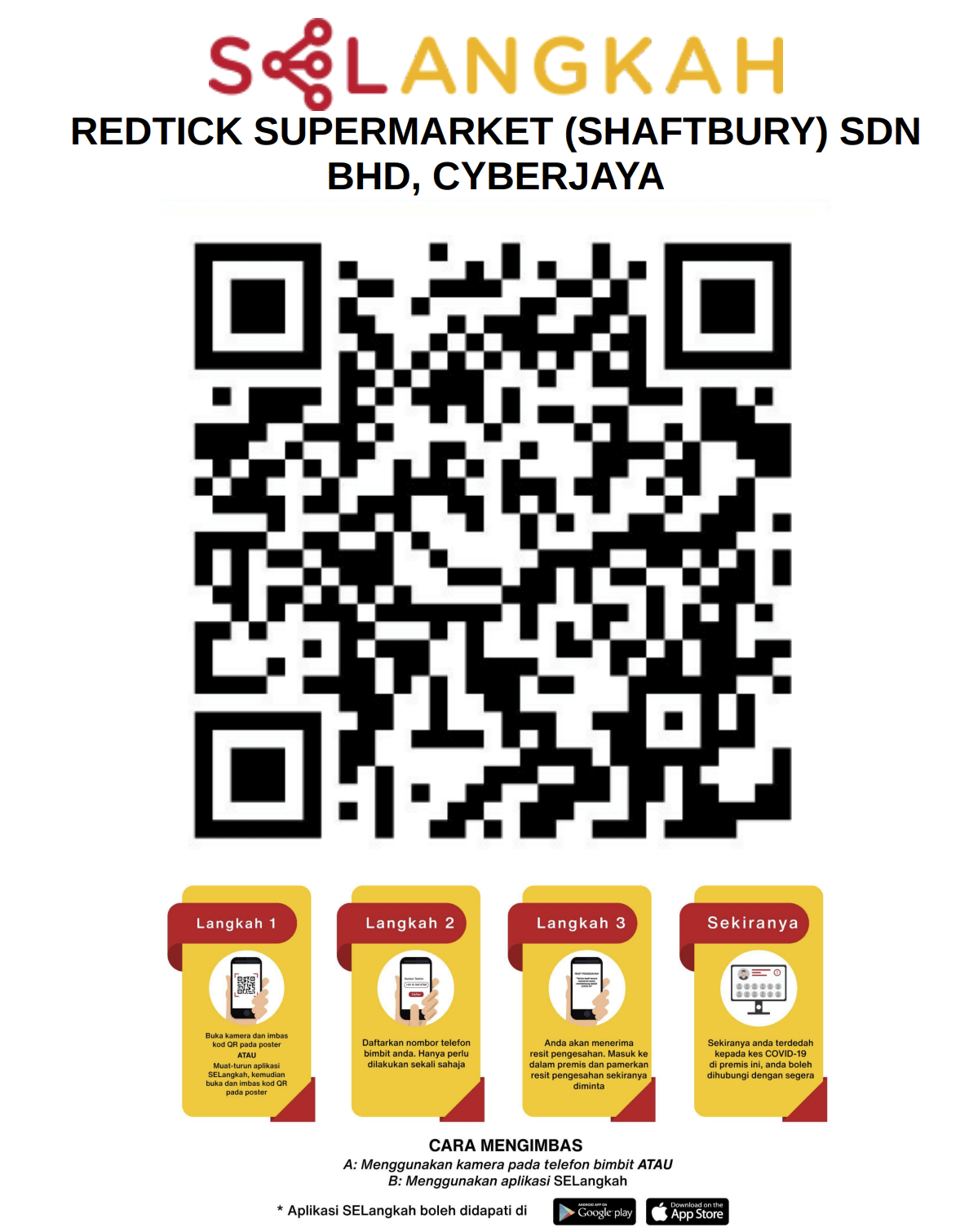
Instead I’d do it like this:

This makes the primary use case more accessible. The QR code is much bigger and can be scanned from much further away. From my testing, at A4 size, the original can only be scanned from about 40cm, and from experience it takes a few tries. The redesigned one can be scanned from about 2m away and is picked up much quicker. It makes it easier for the users and more efficient for the store.
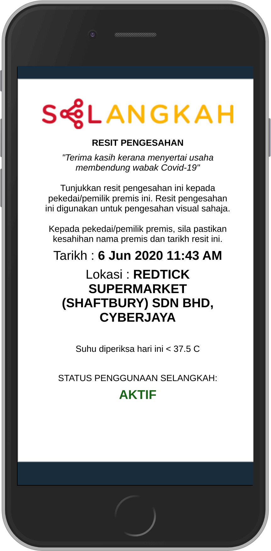
Finally, the status page on the web currently looks like this:

There are two issues. First, that’s difficult for staff to verify. The name of the store and the time are inconsistently positioned due to incosistent length. It also has a lot of text that’s useless most of the time.
Secondly, there should be the the ability to register on someone’s behalf. At the moment, one device is for one person. You need to open an incognito window to register someone else. It’d be much more convenient and efficient if one person was able to register others as well. The most common scenarios would be partners that don’t live together or parents.
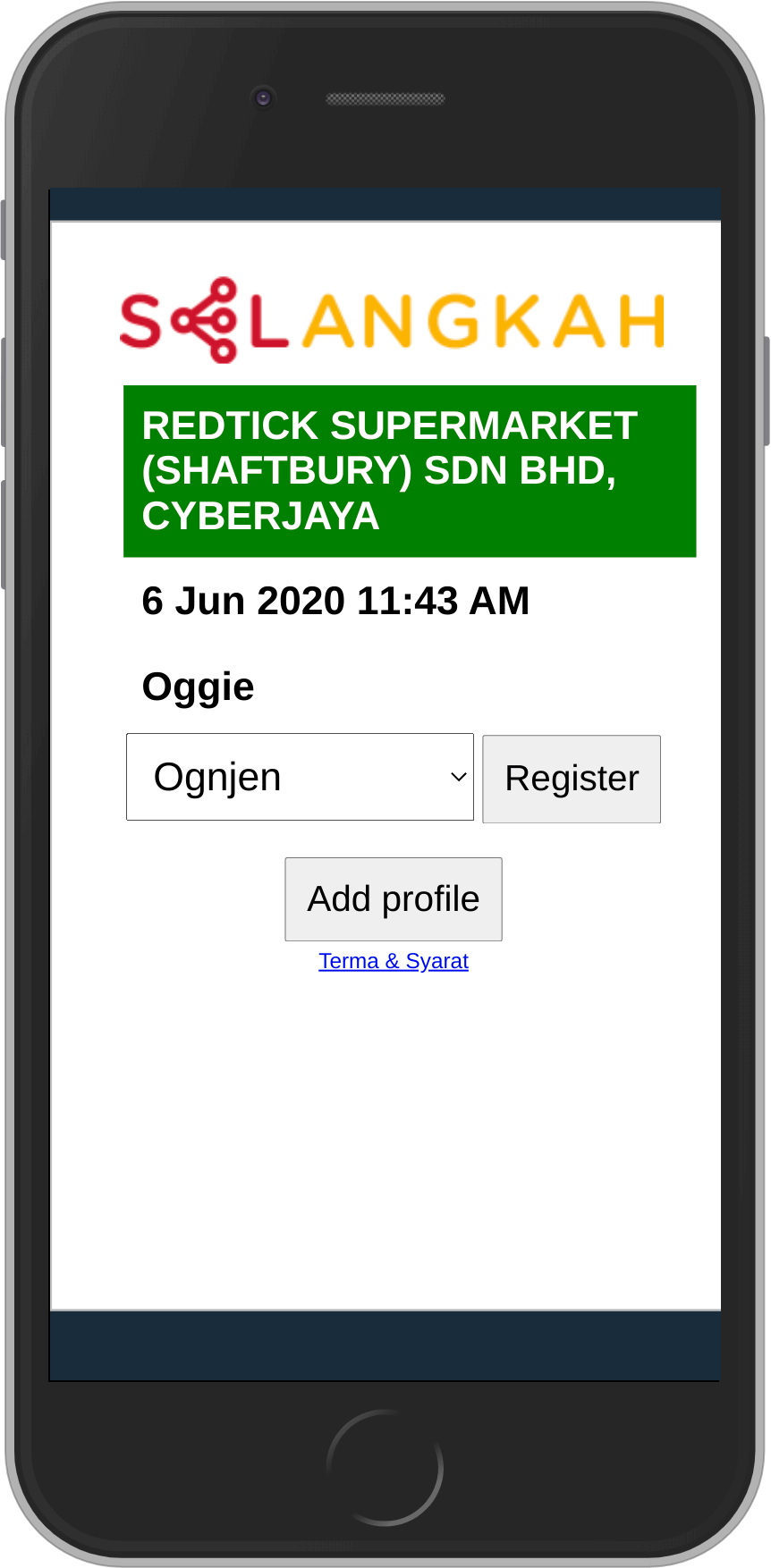
With that in mind, the status page could look like this:

Big green section immmediately indicates that a scan is successful and the name of the store is highlighted. The location of the elements is always the same. That makes it much easier to verify.
Underneath is the optional section that can be used to register someone else. It could be implemented it vanilla JS and not take more than a few kB (that could be saved by removing the image).
Overall, however, I think they did a good job and prioritized correctly, especially when you consider the speed (and scale) of rollout.
(06.07.2020) edit: Selangkah combined with MySejahtera and registering in one registers you in the other as well. Great move.
MySejahtera is slightly better designed but the suggestions about stand if not using the app.
